Wednesday, October 30, 2013

Elsa Schiaparelli

    Elsa Schiaparelli was an Italian designer mostly popular between the two world wars. She started out her career by doing knitwear and later expanded her creations to elaborate fashion pieces. Her clothes were smart and sophisticated and designed mostly evening wear. She collaborated with other prominent artists and designers like Alberto Giacometti and also Salvador Dali who she hired to design fabric for her fashion house. She was part of the Surrealist movement and worked in New York and Paris. For Schiaparelli, fashion was as much about making art as it was about making clothes.


    This evening coat is one of the best examples of her artistic creations which was collaborated with French artist Jean Cocteau. It was launched for the Autumn 1937 collection. Cocteau produced the drawing that is translated on the coat. This is exhibited at the V&A  Museum in London. The picture I took myself when I visited the museum a few months ago. It was defiantly a piece that brought a lot of attraction to the room with its fine elaborated decoration. It is a very beautiful dark long silk jersey coat with gold thread and silk embroidery. On the top back there is this double motif that can be read as two faces facing each other and also as a vase of roses standing on a fluted column. The strong lines embroidered till the bottom elongate more the coat. The embroidered pink flowers that are hand stitched on the yoke and shoulders of the coat makes the clothing more feminine and very elegant.


    This particular evening coat reminded me of a particular collection of Giovanni Bedin, which is one of my  all time favourite collections of the 21st century. For Autumn/ Winter 2010 Bedin designed a collection of some very elegant and fun coats. All of them have basically the same shape but the each one is very unique and different in material and design.This particular one below, has similar flowers embroidered  to the ones of Schiaparellis’ coat. Just like in the coat from 1937 the embroidery in this one make the garment very feminine and fun yet elegant. Contrary to Schiaparellis’ the embroidery is of different bright colours that make a good contrast on the black dark silk. It is a finished corsetted and military-inspired coat which is long til before your knees. The skirt is pleated and has a tutu underneath. This one below is made to be worn on a younger age than the one of Schiaparellis’, I would imagine this on a young woman on her early twenties.


Bibliography
Information and pictures taken from:
http://www.metmuseum.org/toah/works-of-art/1974.338.2_1978.288
January 2013 http://www.worthparis.com/thedesigner.asp
searched on the 26th of October 2013

Sunday, October 20, 2013

Hoffmans' straight lines and cubes

    Joseph Hoffman was one of the founders of the Vienna Secession together with artists Gustav Klimt and Koloman Moser in the very late 1800’s. Though they were Austrian artists they resigned from the Austrian Art Association and moved to Vienna to start the new movement. Hoffman himself was even more popular when he formed the Wiener Werkstätte company which was popular for a wide range of production, art and architecture.  Together with some other artist, he produced many designs, mostly interiors, which are exhibited at the Museum of Modern Art in New York. They had their own unique style which for that time  was classified as very modern.

    The Stoclet House is one of the most popular architectures designed by Hoffman and the Wieners, built during the 1908 in Brussels. It was built for banker and art lover, Adolphe Stoclet. He gave them an unlimited budget and an artistic free hand. It is a very refined luxurious house and in the 2009 it was included on the UNESCO World’s Heritage List. 


    As you can see in the pictures it is a very geometrical and quadratic building, all in grey. The exterior is quite simple and the only thing giving life and colour are the big green bushes surrounding the huge area. Everything else- grey! In my opinion the exterior of this building  doesn’t look like a mansion at all, it looks more like a monastery or a school. It is a very ‘simple’ building and the only decorative lines are the balcony railings and the windows. Only the huge area of the building suggests that it is a mansion and it gives the indication that it belongs to a rich family.


    Its straight lines show the emerging influence of modernism, but it also reminds me of cubism. Franz Metzner sculpted the four figures that crown the top of the building and in the dining area there are a lot of works by Gustav  Klimt. Unfortunately we cannot see what’s exactly in the inside because it is still a private house which is now owned by some grand-daughters of Adolphe Stoclet.

    As we can already see, Hoffmann's style was very sober and abstract and along time he was limiting himself to functional structures and domestic products. This is another example of his strict geometrical line designs called the Kubus Armchair. This was highly popular at the time and this style was common in  middle class family homes. The chair in the picture below, has a geometric composition based on the square, a common element seen in both Hoffman's architectural and furniture designs. The constant use of squares and cubes makes this seating quite modern and classic. The cushioned cubes of thick leather have a classic style and looks very comfortable. As in the above mentioned  building, it is a unique example of combining classic design with modern influence, also inspired from cubism.


    Its Cubist shape creates an urban modern look that is ideal for small flats. It has a wooden solid frame and a deep, cushioned seating that keeps you comfortable and well-supported. Even though I really like this chair, I would not choose it for my own apartment because it is not my personal style. The thick material and the dark black colour makes it very bold and probably it would be a big statement in the room. While doing my research, I found a very similar sofa which I found interesting and would dare to use in my home.


    This desgn was made by Daisuke Motogi and I would defiantly say it is the grandson of Hoffmans’ design. It isvery similar to the original one and has the same shape;  it is also made by many cubes. They are also both one colour and made of the same material. The slight difference is that Motogis’ chair is made of  smaller cubes which count more in number than the other one. Another difference is that it doesn’t have the wooden blocks that serve as chair legs in the bottom. This one has another function than just a seating, it can also serve as storage space. You can simply put small things in between the upholstered cubes form of the armchair. The armchair would be ideal for a living room because you can put your TV remote control in there or some books that you are currently reading. The light colour and soft material makes it more more cosy than the one Hoffman designed. This one looks more fun and less bold in appearance.

Bibliography
Information and pictures:
January 2013http://www.homedesign9.com/2012/11/furniture-collections-that-actas.html : searched on the 20th October 2012
May 2009 http://www.worldheritagesite.org/sites/stoclet.html : searched on the 20th October 2013

Monday, October 14, 2013

William Morris

    As a person who loves textiles and fashion I always look up to William Morris' designs for inspiration. His designs are so unique and contain so much details that I think they can be effective in every style and movement in art. William Morris lived in the 19th century and was skilled in a wide range of arts and crafts but is mostly known for his textile and wallpaper designs. He was a member of the Pre- Raphaelites and the Art & Crafts movement. He had his own unique style and his works can be very easily recognised.


    On top we can see two of his designs. The one on the left is named 'Tulip and Willow' and the other one 'Windrush'. Like most of his designs they are both drawn with pencils and water colours. As we can see, they are similar and have the same theme, this was his style. They are very organic and classic, they have very vibrant and rich colours and each leaf and flower is very detailed. He always named his designs after the flowers they depicted. In all his art work, Morris was inspired from his knowledge of styles and mostly from nature. His designs were a bit feminine and all the woman at his time loved wearing his prints.

    While the Industrial Revolution strengthened the British Empire, William Morris was keenly aware of its drawbacks. He was widely aware that from their childhood, people were going to work and produce repetitive stuff with lack of creation and design. He was against all this and he worked hard to continue to produce designs by hand where each and every product was unique and different. 


    Look at this room put together with the wallpaper and textile prints of William Morris. The designs themselves fit so well together without being too much because of the related theme and same tones of  neutral colours. Together the designs communicate a sense of harmony and agreement. With their colours and design they make the room so cosy and warm. The flow designs of the leaves are vibrant and convey a feeling of movement. Personally, I like the print of carpet mostly because of its strength in colour and also because though the print is big, it is not so intense. 

Some more of his designs:
                                                        Name of design: African Marigold
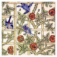
Name of Deisgn: Trellis

    William Morris left a huge impact in design for every one. Its incredible how easily he made it seem that natural forms  found outdoors can be used to decorate the inside our homes. He was a big influence in the 20th century mostly in decoration of churches and houses and his designs are still commercially available as wallpaper and textiles. The movement 'The Vienna Secession' that took place in the late 19th cenury was influenced a lot by Morris. Look at the top of the building in the picture in the bottom. The leaves and the shapes are very much similar to what William Morris would have designed. They have the same shape and pattern. It also has a lot of repetition similarities, just like all his designs. This building is in Vienna and was designed by Joseph Maria Olbrich in the 1897.


Bibliography:
Pictures-
2 September 2009 http://www.artyfactory.com/art_appreciation/graphic_designers/william_morris.html
http://www.flickr.com/photos/timsidford/6722101185/in/gallery-47071837@N02-72157628883042805/
Information-
June 2010 http://www.artyfactory.com/art_appreciation/graphic_designers/william_morris.html
All searched on the- Sun 13th Oct 2013

Sunday, October 13, 2013

Aesthetic Movement

    The Aesthetic movement in Britain was a movement against the industrial revolution but supporting the emphasis of aesthetics in design and that decorative art must first have utility but may also be beautiful. The movement started around 1870’s with a group of artists including William Morris and Dante Gabriel Rossetti. The style was very sensual and organic. Nature themes often appeared on furniture and decoration. Just like the plates from the industrial revolution the blue and white print on porcelain was popular, this time also for ornaments. Painting was very popular in this movement. The Aesthetes believed in beauty in art for its own sake, and dismissed the idea that art should have a moral.

    Ceramics demonstrating aesthetic style tend to be decorated with Japanese-inspired motifs including mostly flowers and birds.  Blue and white were very popular colours for this, not only because they were the most efficient colours to print with but also because they made the best combination of tones for this type of art. George Jones was part of this movement and was very good in working with pottery. This is a very typical work of his; it is a cup and a saucer set.


    The cup is very wide, not usually the typical design we find today. It has more of a bowl shape than an actual glass, but this style makes it look more elegant and fashionable. The ear of the cup has pointy edges, this will make the person using it easier to hold. The shape of the ear reminds me of the roots and branches coming out from the trees. The painted design on the set is also very organic. The beautiful flowers and leaves give a character to the tea ware and the golden trimming at the edges make it look very rich. Jones was one who identified the need for a new and modern style but saw no reason to reject the lessons of the past.

    Edward William Godwin was an English designer during the mid- Victorian ages, and later moved on to a more modern taste of the Aesthetic Movement. Godwin got inspired mostly from the Japan style and also from linear lines. The table we see below reflects a lot his character. The elegant straight lines make the design very fancy and bold. The use of metal in the corners and side braces also indicates the inspiration from the Japanese design. The table can also be used as a set of shelves, which may be useful especially for the kitchen, you may put food on the bottom shelve while working on the top. The sides are flaps that you can put up to use and put down when you don’t need them. This is very functional if more than two people are sitting around. This also helps the room have more space when needed.


    While doing my research I found this contampory piece of furniture which personally is very similar to the one of Edward William Godwin. The designer of this furniture is Bertrand Besnard who named his creation Fuzo, a furniture piece that can be used as a shelf, seat, footrest, locker or pot depending on how it is put together. Fuzo is a set of metal and cork pieces that you can distort and create the shape you need depending for the function you want. Just like table of Godwin you can adjust it yourself for more than one use. Both tables have the linear rods at the bottom, these can be used for resting your feet while sitting around it. This design is both fun, and functional, adaptable to many situations. 


Bibliography:
by Erin on September 10th, 2013 http://www.contemporist.com/2013/09/10/fuzo-by-bertrand besnard/fu_090913_04/
Dr Anne Anderson on 26 January 2011 http://www.cranleighdfas.org/rev1101.htm
searched on the 11th of Oct 2013

Saturday, October 12, 2013

Industrial Revolution

    The industrial revolution started in 1700’s in England and spread quickly in Western Europe and America. Big, special purpose machinery were invented and factories began to open everywhere. Before these factories were opened, necessary items were mostly made at home, using hand tools and basic machines. People rarely used an item made outside their community.

    The Industrial Revolution came along  because of the steam power and powered machinery, which was a gateway to  factories. There was new mechanization of the textile industries, the development of iron- making techniques and the increase of refine coal. This huge development brought about huge improvement on roads and railways, and canals were invented.

Picture taken from:
http://www.historyatfreeston.co.uk/fbechistorysite/ks3/industrial%20revolution.htm
On the 10th Oct 2013

    Up until the Industrial Revolution, design  was  barely changing throughout the years. The history of Industrial Design really began with the start of the Industrial Revolution. With factories everywhere, many products were produced every day because  items was made much quicker and  they were sold much cheaper than before. This is called the mass production.

    Ever wondered why old plates were only white with blue ink? It was because plates were easily made with the machinery at the time and were mass produced. But paint was still very expensive, so a printing technique was invented; this technique could only print in blue . This blue pattern is called the Willow Pattern. I remember eating from these plates when I was a child at my grandparents house. In my opinion these are more fun because of the print on them. There used to be all kinds designs printed on them.

Pictures taken from:
http://www.marks4antiques.com/China-Patterns-Description.htm
On the *th Oct 2013


Design was revolutionised with the Industrial Revolution, bringing along changes in the way of living and changes in every aspect of daily life. Today we don't realise how this made a huge impact to the world and we are still effected by it. 


Informatian taken from sites:
May 2006 http://www.yale.edu/ynhti/curriculum/units/1981/2/81.02.06.x.html 
23rd Nov 2010 http://www.industrialrev.com/
On the 10th Oct 2013

Thursday, October 10, 2013

What Is Design?

    Is there really a definition for the word DESIGN. Maybe first words to describe it is creation, a plan for construction, something created for a purpose, a thinking to a process, the thinking before the object was created. Everything around us is designed, weather it’s a car, a building, a sharpner or a poster. Everything that has been made had a process for design. Design is made to make your life easier. Design is the most important thing for producing something. If the car seat of your car wasn’t designed properly, it could be unfunctional or uncomftable to sit in. Very few people realize how design is important to life. You have the furniture that you have at home because from all the different designs in the shop, those are the ones that caught your attention the most. All quality, costs, process, production, function and material of any product are what they are because of the design.


Image from: www.google.com/what is design
searched on: 10th October 2013