Sunday, November 10, 2013

Coco Chanel and her Little Black Dress

    As, style icons go, Coco Chanel was the most famous woman of her time. During the 20’s and 30’s, her little black dress, easy jersey fabrics, masculine tailoring and even trousers were match with bobbed haircuts and suntanned skin. Chanel became a global phenomenon twelve years after her death, when Karl Lagerfeld reopened her brand and making the fashion house one of the largest in the world.


    In 1983 Gabrielle Bonheur “Coco” Chanel was born among six siblings in France. When she was twelve she was sent to an orphanage run by nuns because her family was really poor. Here she learnt how to sew. Some years later she got her first job as a seamstresser. When she was twenty five she opened her fist hat business. In five years her business went from hats to all kind of garments. It didn’t take long until she got mentioned in Vogue. She was successful because she was the first ever designer to loosen up all woman clothing and make them comfortable. From wearing big bulky skirts she started designing women trousers. She started using men fabrics for women clothing. This made the clothes much more comfortable than before. Chanel produced cardigans and twinsets, ad adapted men’s sweaters to be worn over straight skirts. 

    Before the 1920’s wearing black was a sign that the person is mourning. Black was never worn for everyday life especially by women. This all changed until Coco Chanel in 1926 launched her little black dress named ‘Chanel’s Ford’, because like the Fords’ model T it was a dress accessible to woman from all classes. Vogue published pictures of this dress in that same year were they called it “uniform for the modern women”.  The story behind this little black dress was that she started wearing black as mourning after her loved one Boy Capel died in 1919. She designed this dress mainly for her, and later for the market. Even tough it was on Vogue, people didn’t want to wear black except for funerals and it was only in the mid 30’s that this dress made a huge hit in the market. Below is a picture of the ‘Chanel Ford’ dress. It looks very elegant and flowy. It looks very versatile: depending with what you wear it, it can be a day dress, or an evening dress. 


    Under Chanel’s dress there is a picture of a dress from 2013 sold from ASOS.com. They look so similar! Chanels’ designs were so futuristic that we still wear very similar clothing. The only difference between them is that the latest one has long sleeves, but the body shape is exactly the same! The other small difference is that the one from ASOS.com has a waistband at the waist. Both round necklines are the same shape and both are very flowy. Materials must be also very similar because they both look that they from some thin material, eight satin or cotton.

Bibliography:
James Dean Oct 2010 http://onthisdayinfashion.com/?p=6210
http://www.asos.com
All searched on the 3rd Nov 2013
Deborah Bee Harrods Publishings 2010 Couture In The 21st Century

Tuesday, November 5, 2013

Bauhaus

   Bauhaus was a movement and a school in Germany built in 1919. The style was mostly simplity design without too much ornament. At this school, cabinet making was very famous along with creating abstract textiles and metal working. Their designs were mostly industrial designs. Famous teachers in this period included, Walter Gropius, Johannes Itten, Paul Klee, Lyonel Feininger, Vasily Kandinsky, Josef Albers, Oskar Schlemmer, László Moholy-Nagy and Ludwig Mies van der Rohe. Unfortunately the school was shut down by Nazis in 1933.


    This is a Tea Infuser and Strainer which Marianne Brandt invented in the 1924. Brant spent all the days at the metal workshop while she was studying at the Bauhaus and she produced this while she was still a student. Its’ materials are the silver and the ebony, with the use of pure geometric forms, including the hemisphere, circle, and cylinder forming the teapots shape. Like other functional Bauhaus items, the teapot was designed to work well in addition to looking good. It seems well balanced and easy to hold. The shape is very different than the traditional teapots. Brant achieved to think outside the box to produce a shape we never saw before.


    The table lamp seen above is often called as the ‘Bauhaus Lamp’, which was designed by student Wilhelm Wagenfeld in 1924. The lamp was very popular at the time, this is because it takes very few space on your desk and was very efficient. It was a very modern design for that time, even today it looks very Modernistic. It is made out of a metal base, a cylinder and the bulb cover made from white glass. The colours look very clean and fresh. It goes well in any kind of room because the both colours and shape are neutral. This is another perfect example were form follows function. Throughout the years many versions of this lamp have been created and is still categorized as classic modern.


    As anyone can tell, the lamp above has nothing to do with the Bauhaus. This one from Art Nuoveau by Byron Vreeland, around fifty years before the ‘Bauhaus Lamp’ was produced. There is a huge difference between them. Both are desk lamps and both have the same shape- a base, a cylinder as a neck and a glass cover for the bulb. The one from Art Nuoveau has too much details and decoration compared to the one from the Bauhaus, where we can say it is all plain. The metal from Vreeland has very detailed lines carved in similar to a tree branch and has leaves motifs on the base. The glass cover is also very detailed with stained glass. This design is very organic. Even though the one from Bauhaus is very modern, I think we should appreciate certain design like this from Art Nouveau beacause they look like they consist of much more work to do.

Bibliography:
Dr Marcus Bunyan 2012 http://artblart.com/2012/05/12/exhibition-out-of-the-forest-art-nouveau-lamps-at-the-nevada-museum-of-art-reno/
2000 http://www.tecnolumen.de/12/
2013 The metropolitan Museum http://www.metmuseum.org/toah/hd/bauh/hd_bauh.htm
All searched on the 4th of Nov 2013

Monday, November 4, 2013

De Stijl

    De Stijl which literary means ‘the style’ in Dutch, took place in Holland in the early 1900’s. It was both an architectural movement and a visual art movement. It was basically a movement where members believed a lot in harmony and spirituality. Design was pure abstraction. The style had limitations to just the essentials of form and colour. These painting are very simple, all similar, consisting only of horizontal and vertical lines, basic shapes as squares and rectangles, the three primary colours and black and white. Artists emphasised a lot on simplicity; they believed that life should be simple. The whole purpose of the painting was to make it as simple as possible, so that the artist was able to express his simplicity. This fascination with shapes was borrowed from cubism. An important aspect of these paintings was that they were never framed because artists believed that the lines of the paintings were supposed to be continuous extensions of the world.

Piet Mondrian
Oil on canvas
London Tate Gallery

Theo van Doesburg
1917

    The famous Red and Blue Chair was first designed in 1917 by Gerrit Rietveld and was one of the first 3D designs of the De Stijl movement. This chair was made from beech wood and was not painted, until Bart van der Leck created a newer version of it in the 1920’s. He painted the chair black with areas of primary colours. Just like the paintings, the chair is very geometrical, with straight continuous lines. It is not a chair to sit comfortable on, but to have a bold statement in a room. It doesn't look comfortable at all. It is designed more for decoration. This chair became an icon of the De Stijl movement. The four colours of the chair are very bold and pure.

    A very important building, designed also by Gerrit Rietveld is the Schroeder House, which was bult in 1924. At the time this house was very modern as a design. The houses that were built recently around it, seem older than the De Stijl building. This shows how futuristic Rietveld ideas were. The building basically looks very similar to one of the paintings at the time. Both interior and exterior is designed only with straight lines and no curved edges are found.


    Rietveld designed the house that could create a connection between the inside and outside, in fact both exterior and interior are very similar. Every form inside the house was designed for a function. The inside is designed as an open plan with only sliding walls and doors, so that the person living in it could make rooms only when needed. He also created the furniture for temporary purposes. Some of the furniture is designed that you could hide it when you are not using it. For example, the kitchen benches are hinged to the wall, so that they could be closed when not in need and more room is created in the house.


Below are pictures of the De Stijl style in todays world. This style is still being loved by people and designers, and below are clothes and items that are designed and inspired from this style. Both the Adidas and Vans shoes are very modern in style and trendy. The painted nails are very fun and bold. The dress was seen on catwalk for autumn/winter 2009 with a whole collection inspired from De Stijl designed by Prada. All these designs are a perfect representation of the famous paintings with yellow, red, blue and monocrome colours. 


Bibliography:
1995 by Charlotte Jirousek http://char.txa.cornell.edu/art/decart/destijl/decstijl.htm
14th Dec 2012 http://saratantib.blogspot.com/2012/12/de-stijl-fashion-design-transformation.html
All searched on the 3rd Nov 2013

Sunday, November 3, 2013

Frank Lloyd Wright

    Frank Lloyd Wright was a great architect during the late 1800’s and early 1900’s. He was one who believed in organic architecture, in designs for homes and for commercial buildings. Over his career he created numerous iconic buildings and nature was his inspiration behind all of his works. All the homes that he built were in nature surroundings, using natural materials.

    Wright's built the Oak Park Home & Studio, and Taliesin as homes for himself. Taliesin West was an ongoing project, one which he altered and refined until his death. This is a huge beautiful building built in a very quiet place in Arizona, west of the United States. Lloyd didn't move inside this building until he was almost seventy years old, and spent his last winter years living here with his family. When this house was first built, it was practically a desert camp with canvas roofs for protection from the weather. It was a very cosy house were it brought all the family together. Later, windows and roofs were installed and finally it stood as a series building of offices, studios, theathers and recreational space for himself, his family and also for students who came here to study. Frank Lloyd Wright spent his last few years teaching new architect students in his own home.


    The building itself is built from different stones, making the exterior look very vibrant with all the different neutral colours. The windows and the front door are painted red, which make a great combination with the brown and grey tones of the outside walls. The outside impression is of a wide building, and from inside, it is huge. All the rooms have very huge spaces. The railings around the house are painted in bronze; giving a rich look to the place. All interior is based on the natural and red colours. The furniture is very geometrical and simple. The room, which Frank Lloyd Wright called the 'Garden Room' is a huge hall with glass walls, from which the garden can be seen. Wright liked bringing the outside in the inside and you could feel this, practically all around the house. Studios for design were built and and students used to go there for a period of time to learn. The great architect insisted of having the place filled with pianos and there is one in each public space, 18 pianos in all. The building itself is around 12 miles away from the urban cities and of course, because of this, it is a very quiet and isolated place.


    Another master piece of this great architect is the Falling Water, this time built  in Pennsylvania in the East of the United States around 1936. It is the most famous of the twentieth century houses. Among the wild flowers and rivers, stands a work of art. Frank Lloyd Wright was inspired by the young people playing and swimming in the river in the area of the building and he used the water as the focal point of his design. He placed the building exactly above the waterfall of the river. Just like his building in Taliesin, it was built among nature, far away from the city using natural materials. He wanted people not just to live around nature, but to also become part of the nature around. For Wright, organic architecture should be based on nature. He only used natural materials that were found in this area to build this building. 


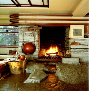
    This dynamic building is suspended over the falls which pour down from underneath one of the terraces. The building seems to grow out of the landscape. The building was built among the rocks that were already there, and also built around the trees that were growing at the moment. The only material he used that wasn’t from the surrounding was concrete, that he used to build the big bold terraces. These massive terraces around all the nature, provide a living area without a roof. Most of the walls are built with glass, this makes the inside with very natural bright light during the day, and a beautiful calm atmosphere during the night. Similar to the house of Taliesin, the furniture inside is very simple. Long sofas are put in living area among the walls leaving space in the middle, making the room spacious. A fire place built with stones make the room very cosy when lit. The only sound you hear from this building, is the sound of the water and of the birds. In few words this is a very luxurious, quiet and giving a spiritual atmosphere to the house.


    Studying Frank Lloyd Wright and his buildings defiantly reminds me of a certain place in Malta- the Mistic building in Pembroke. I couldn’t find who designed the architecture of this building but the owner of it was Joseph Scicluna. It is a huge building that used to serve as a very famous night club during the 1960’s. It is surrounded by nature and has a very beautiful view since it is built on top of a high hill. The building has some very wonderful architecture which looks somehow like a fairytale palace. It is built all in stone. There is a lot of glass designs in the walls and floors mostly rows next to rows with bottles embedded in the stone. There are designed with marble and glass of the Maltese cross in most of the rooms and a guitar shaped table which still remains as a whole. Downstairs in the garden bar there are glass owls and peacocks on the walls. Just like the Falling Water huge terraces surround the place, one of them, near the indoor bar area,  which is very pretty spectacular. I could see myself in the 60’s with music from inside, just enjoying the beautiful surroundings of nature. The vibe of this building is pretty peaceful. Unfortunately today, this building is abandoned and not taken care of. 


Bibliography:
September 26, 2011 by Ramon Adepares http://www.ramonadepares.com/2011/09/26/across-the-threshold-to-fairyland/
George Pudlo on April 17, 2013 http://www.allwrightoakparktours.com/apps/blog
All Searched on the 2nd of Nov 2013

Art Deco

    The twentieth century became a century of speed! The industrial revolution had transformed the world more to an easier and quick life. Both world wars had destroyed all sentimental items and Modernism was the new thing and there was no going back. Art Deco which started around the 1920’s borrowed aspects from all design styles of before in order to fashion the future. It involved every aspect of design including architecture, interiors, fashion, jewelry, painting, graphics and more. The style was all about glamour. Architecture had all shapes- curves and streamlining , vertical lines that lead to sky scrapers and horizontal lines that were clean and cool. In Art Deco there was a lot of experimenting with colour and it was all about turning life into art. Art Deco was less decorative from Art Nuveo. In 1922, there was the discovery of the Thomb of Tutankhamen which inspired all artists of the time. Certain materials were very important in design such as ivory, enamel, shagreen, ebony, and the mother of pearl. 


    Above is an example of an Art Deco magazine cover. It is the France Vogue from the 1930’s. The design is very cool and clean. It looks very chic and elegant. The title is bold but still very smooth.  There is a small Eiffel Tower drawing in front of the light pastel colour which looks very dainty compared with the fashion sketch of the woman wearing brown. The page is very decorative with a stylised look. The Art Deco movement is also characterized by clean lines, streamlining, and symmetry.

    Eileen Gray was one of the architects and designers who have left a significant mark on the 20th centuty. She designed mostly furniture, some which can still be found in the market today. Gray was one who wored mostly alone and not with a company or a group of other designers. She was one of the first feminine designers of the century. Her designs were very modern for that time and also very unique. 


    The chair above is one of her most famous furniture designs- Bibendum Chair. It is made out of leather and tubular steel, which form a very chic style. For the time being, it was a very different chair from the once invented before. This one was very juvenile and fresh. It looks very comfortable almost like a sofa. It is both aesthetical pleasing and with good functionality. In her designs Eileen Gray focused mostly on form and highly stylized geometrical shapes. The Bibendum Chair is a big bulky chair made out of curves and circles. The same exact design is found produce by many companies, and it is her great style that makes her work so prized today. I looked up on the web and found some starting from 2,500 euros!


    Above is a Contampory sofa that has some elements very similar to the one of Eileen Gray. This sofa is designed by the ‘Sofa-Beds Furniture’ company. They are both made out from steel and leather. The main similar element of both chairs is the form. Both their designs are very circular and with curves. The Contampory one is much more bulky and bigger in size, but must be more comfortable since it has more cushioning and also a foot rest.  The one of Eileen Gray is more elegant and also maybe more feminine. This must be maybe because the one from ‘Sofa-Beds Furniture’ reminds of cars because of a similar shape. The mix of red and black leather makes the big sofa more fun. Since it is very bulky this will be the main attraction in the room, unlike the from Art Deco that would be very suitable in a corner in the office.

Bibliography:
2013 http://sofabeds-furniture.com/2011/02/14/funky-and-contemporary-vista-sofa-vibrant/funky-and-contemporary-vista-sofa-vibrant
2007- http://www.yootheme.com/zoo/apps/index.php?option=com_zoo&task=item&item_id=92&Itemid=3
September 2013 http://artdecoblog.tumblr.com/image/68319677879
All searched on the 1st of Nov 2013

Saturday, November 2, 2013

Art Nouveau

    Art Nouveau took place mostly in Paris France during the end of the nineteenth century. It brought about a huge change in lifestyle and the way people acted. Design in general was very different from the previous times; it was inspired all from nature and was very sensual.


    At that time, big changes in lifestyle were happening in Paris. The population increased from half a million to two and a half million in a very short period of time. Automatically big changes in the city lifestyle were happening. The city became overcrowded and full of energy. People started socializing and partying a lot. They used to spend most of their time in bars and theatres. They starting spending a lot of money on entertaining.  The woman became a huge figure in society and that’s from where the artists got most of their inspiration from: her figure, her curves and her pride. With the complete change in life, a new style of design was born.

    Alphonse Mucha  was a fine artist of this time. He was still very young in the business when he designed his big hit poster for Sarah Bernhardt who was a very famous stage girl in Paris. Before become famous Mucha was passing through bad times struggling as an artist. He designed Bernhardt poster in a venture just to help out a friend. The poster that he made, became so popular that people starting selling stickers and objects with the same design on it. Bernhardt immediately liked his work and hired him with her with a contract of six years. This design was liked mostly because the artist managed to depict her exactly how she felt and how she wanted herself to be seen. In the poster, he depicted the figure very long and feminine. He crowned Sarah with flowers in a particular style. Light pastel colours were used for the whole poster. There is a lot of flower detailing on her clothes that make her look very beautiful. Mucha, like all artists from Art Nouveau inspired himself from nature and organic and human forms. With this poster he became popular overnight.


    Before Art Nouveau, jewellery was very bold and big, it was all about the bling and about who has the most expensive diamond. Rene Lalic was a great jewel maker in Paris during Art Nouveau. He came out with different style in jewellery. He did not heed the big stones and the expensiveness of the jewellery. His jewellery was all about design. In his designs there was importance to the perfection of material, colour and the right texture. He was not fond of expensive material. He created dramatic jewellery for glamourous and elegant women. He used cheap material but had designs that were dramatic and were used mostly  for nightlife. He was inspired mostly from the sensuality of the woman and nature forms, mostly of the butterflies, bats and insects.


    Above, are two designs of Lalic. They both have a lot of details. The snakes skin, on the left looks so realistic and their open mouths are so dramatic. The two pearls inside the snakes' mouth makes the design so elegant. If there weren't the pearls, it wouldn't look as feminine and pleasing as it is. The chain chosen for the pendant is very simple, yet there's a pleasing way of combination with the pendant. On the right is a complete different design, the shape of the whole pendant reminds me of the shape of a leaf and the diamond pattern looks like its veins. The roots of the trees are printed at the bottom with some very beautiful light blue.  A naked couple is engraved in the middle of the whole design. It is a very organic and sensual design. It is very elegant and graceful design. The woman who wore this must have been a high class woman.

Bibliography
http://www.metmuseum.org/toah/hd/artn/hd_artn.htm
http://www.alfonsmucha.org/
All searched on the 2nd Nov 2013