Pop Art and Design started in England in the 1950’s and made
its way quickly to the United States. It was a period of optimism after the
World War II had ended. Pop design was all about bright colours, fun,
freedom, change, odd forms and about the use of plastic. During the time there
was a wide range of new technology that changed people’s lives. It was inspired
mostly by posters, packaging, comics, magazines, popular culture and also mass production.
Famous celebrities and singers left a huge impact on the peoples’ lifestyle and
design. Among these were The Beatles and Marilyn Monroe. Design wasn’t about simple
line or fashionality, but about something that doesn’t make sense. Unfortunately most
products were made from cheap materials and they were of poor quality. People started
to feel the need to buy stuff they did not really need.
Fashion was defenately inspired by the fact that in those days the man
landed on the moon for the first time. It was inspired by space. White was very fashionable, because the spaceman suit was originally white. It was a period where both fashion and textile designers
collaborated a lot with science. One of the most fashion designers who tried to
collaborate future with fashion was André Courrèges. He was a French designer.
In 1964, his latest fashion line was published also in Vogue magazine and the
designs were very popular. This was a collection of white and red. White was
the colour inspired from space and red was used to make the designs more fun. He
used futuristic fabrics, including PVC and vinyl. The designs consisted a lot
of A-line dresses and geometrical shapes. Each design was a bit different and
they looked very futuristic. The designs looked like they could be worn today, but
in different materials. Each of them is very decorative and young. Underneath is a picture of the collection I am talking about.
 Peter Blake is a Pop Artist and Designer who designed works that
we are still familiar with. He went to
art school when he was fourteen. He was originally a painter but he had to do
the commercial art for a living. He also studied as a graphic designer. He was a
painter with a background of graphics, and this effected a lot his work because
he had his very own unique style. One of my personal favourite designs of his
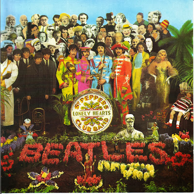
is the famous album cover for one of The Beatles records. The picture itself
screams out – POP. Its’ design is very different from anything that was
invented before it is colourful and it has a lot going on. The four band
members are design wearing the brightest clothes among a big crowd of other
people, some of whom were famous at that time. It was originally a collage, in
fact it looks like bits and pieces were stuck on each other.
Underneath the picture of The Beatles album cover, there is
one of Eminem from the twenty-first century. There is a sixty year difference
between them. The one from Pop Design looks more formal since the people are
all standing facing the front like they are a group of people posing for a
picture. The one of Eminem is like a scene from everyday life- lying down in
bed travelling through his thoughts. The
one from today is more like a photo while the other looks like an art piece
itself. The one of Eminem looks more simple and free. The one from The Beatles
has a lot going on, you have a lot to look at, and has more decoration. Even
the writing is a lot different. Eminems’ is simply typed with computer
typography, while the other is decorated with flowers in a garden. This
contrast makes us more aware of the impact left in life by the camera and other technology.
Bibliography:
Merlusc 2012 http://roxana-signs.blogspot.com/p/contact.html
2008 http://poulwebb.blogspot.com/2012/11/peter-blake-album-covers.html
all searched on the 20th of November 2013
.jpg)


No comments:
Post a Comment